
Product redesign
Reimagining the Admin Hub as an intuitive workspace prioritizing key information and structure for effective workflows
- Company
- BlueMatrix
- Role
- Designer
- Tools
-


From cluttered interface to intentional, structured design
Before

Buried navigation under competing elements with no clear hierarchy or responsive behavior
After

Reorganized layout with clear information hierarchy, contextual navigation, and responsive behavior.
- Replaced the flat, full-width list of links with a persistent sidebar, so any admin area is one click away from every screen
- Grouped settings into User Info, Template, Topics and Settings, each with its own icon and a link plus one-line description
- Laid the landing page out in columns instead of a single table, and added a banner area for system-wide notices
- Updated the top navigation and account area to match the rest of the Creator platform
Before

Editing controls were hidden off-screen with no visual structure to guide the user.
After

Actionable items surfaced in context with a cleaner, more trustworthy aesthetic.
- Swapped the radio-button category list and scrolling list box for a second navigation column that shows the current category and selected record
- Reduced the competing all-caps buttons to one primary Edit action, with New and Upload moved to the page header
- Gave details, text and comments their own titled panels, with readable label and value rows
- Added an empty state and collapsible dynamic codes, so the page no longer shows blank sections or long lists of codes by default
Redesigned issuer configuration screen
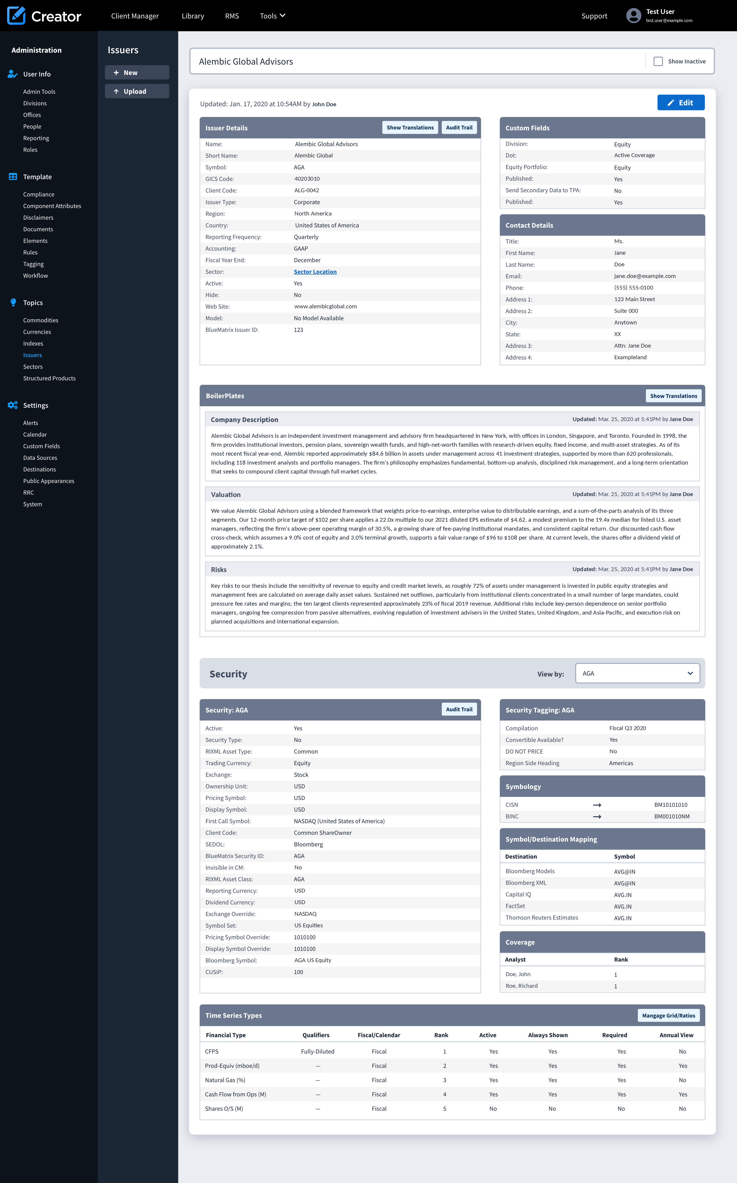
- Edit is the single filled primary button; Show Translations, Audit Trail and Manage Grid/Ratios are smaller secondary buttons inside the panel they act on
- Related fields are grouped into panels (Issuer Details, Custom Fields, Contact Details, Security, Symbology, Coverage) in a two-column layout, so a long record reads as sections
- Alternating row shading and consistent label alignment make long field lists easier to scan
- Each boilerplate shows who updated it and when, next to the text it applies to
- A View by selector in the Security section switches between securities without leaving the page
Product Reskin
While a full redesign of the author queue wasn't within scope, I led a focused reskin of the interface, partnering closely with product and engineering to deliver a modernized, streamlined UI. The update preserved core functionality while enhancing reliability and strengthening user trust.
Before

Excessive iconography and unstructured whitespace made the interface difficult to scan.
After

Decluttered layout with exposed filter controls and a modular structure for clearer document management.
- Moved search criteria into a filter panel with removable chips for the active document types and authors, so applied filters are always visible
- Added a Status column (Published, Pending) and a Preview menu offering PDF, HTML, Email, XML and RIXML
- Rows expand in place to show authors, attachments, distribution options and comments, replacing the row of "+" icons and square preview boxes
- Added issuer coverage, sector coverage and workgroup panels beside the queue, using space that was previously empty